Case Study - Rooter Man
Mockup
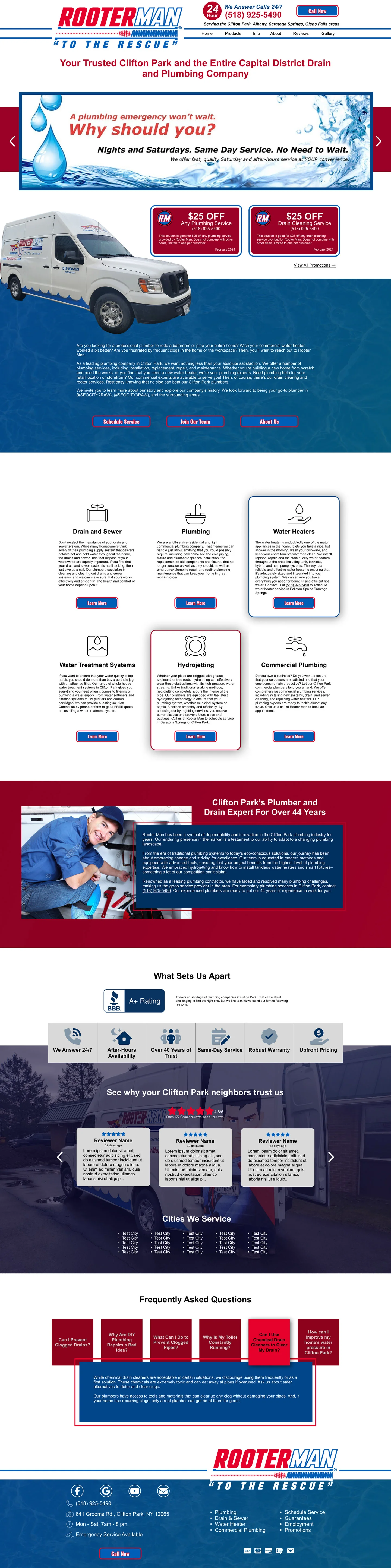
The customer presented a constraint we get often: working with mainly red and blue color. The customer was very clear about wanting that color scheme, so I took a couple of slight variations of the colors, and built the different assets off that, maintaining a sleeker design, keeping in the elements requested like the slider in the hero section from his old website.

Live Site
There were a handful of small challenges that I had fun overcoming with this one. The sticky header with the logo adjusting after scrolling was a simple solution, but effective. The boxes in the 'what sets apart' showing the content on hover was challenging to get it to space appropriately.