Case Study - Online Access Logo and Branding

Background
During a point Online Access was looking to redesign their website, the idea had been brought to modernize and update the logo and subsequent branding. Dozens of assets and subsequent graphics would also need the treatment, the first step was creating a solid foundation: the logo.
Before the Design
The direction given from the owner in the initial stage was minimal but open. My thinking process went along the lines of:
- It needed to be simple and recognizable, even when other assets would reference it
- It needed iconography and elements that could be built off of, and reused
- It should reference the old logo to a degree. I didn't want it to be entirely detached from the logo, possibly alienating older customers.
This was what the logo was first.

Design Beginnings
When creating the new logo, I focused on these areas
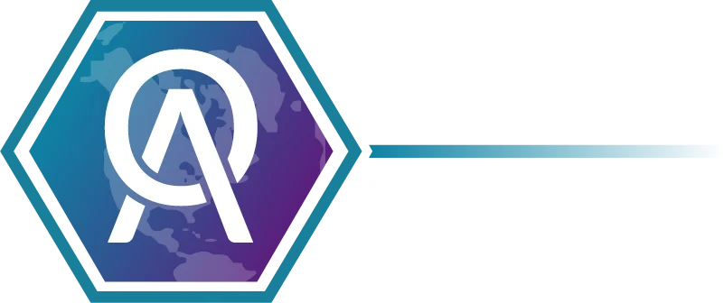
Shape Language
After some research I settled on the hexagon for the base shape, it represents one of the geometrically strongest shapes, causing it to be used in much of the media representing futuristic technology. I wanted to give it that recognition to technology, tying it back to the software and technology side of the Company.

Fonts
The font family I settled on was Lato, after some meetings with the owner, he seemed pleased with a thinner type. Still readable when at a larger size, and for branding, the font had variable weights, but gave it a sleek and modern feel. Additionally, it was confirmed that the company wanted to drop the hyphen from the name.

The Symbol
The icon was probably the hardest part. A simple joining of the O and A seemed like the most obvious choice, but keeping the symbol simple, and the letters still readable was a challenge. Strangely enough, it led to probably my favorite moment in this design process. The owner and the heads of a few of the departments looked it over with myself, and with their feedback, we came to a consensus, the O partially overlapping the A in its exact manner was what came of that, something everyone got a part in.
Referencing the Old
Finally, in the colored hexagon behind the icon came the map, which was pulled from the old logo, but zoomed in more, to focus on the service area of the company. Additionally, I actually got the idea of the line originating from the hexagon from the hyphen that was removed from the company name. It is a small element, but still helps tie it together.

Results
What came together was a logo that I felt proud of. Both as a strong symbol of the company, and something that the people of the company helped come together to finalize.
Product Design
Based on this design, all the products that Online Access offered were to be adjusted to match the branding of the new logo, and new products had that design idea as a basis.

Seasonal Logos
Another idea that came from this about a year later was the idea to have seasonal logos. The halloween one was the first to be made, and after a proof of concept, the owner greenlit it for a few major holidays, and a few more were requested as a result.


The logos even provided me the opportunity to do some animations, which was a challenge in itself. My manager at the time was concerned that just an updated logo on the website could leave people confused, and I suggested creating some sort of animation, where the logo started as the original, then transformed into the new. It was agreed on, and I tried several animation platforms, but ultimately figured out how to animate the logos with CSS. Some of the logos proved to be to difficult to animate, or fell short of that due to time crunch, but here were a few of the results:
Wrap-Up
All in all, it was a pleasant design experience. I am pleased that the company has continued with the logo, and the branding of their site, products, marketing and more are based off this idea.